Designing High-Converting UI/UX for FinTech & Web Platforms
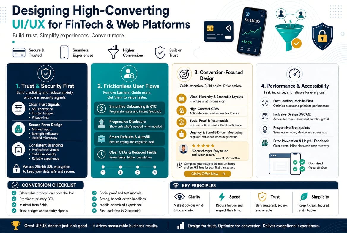
In financial tech and complex SaaS applications, user interface (UI) and user experience (UX) design directly impact revenue performance. When users manage money, apply for loans, or interact with financial dashboards, friction converts into anxiety, leading to abandoned workflows.
Designing high-converting UI/UX requires moving beyond visual aesthetics to focus on friction reduction, clear feedback loops, and trust-centered design patterns.
1. De-risking Digital Onboarding and Identity Verification (KYC)
Onboarding drops off rapidly during user registration, especially during Know Your Customer (KYC) verification, document uploads, and identity confirmation.
┌────────────────────────────────────────────────────────────────────────┐
│                     FRICTION VS. CONVERSION UX                         │
├──────────────────────────────────┬─────────────────────────────────────┤
│ High-Friction (High Drop-off)    │ High-Converting (Low Drop-off)      │
├──────────────────────────────────┼─────────────────────────────────────┤
│ 10-field monolithic forms        │ Multi-step progressive disclosure   │
│ Vague validation errors          │ Real-time, inline field feedback    │
│ Surprising document requests     │ Early context setting & camera guides│
│ Unclear security compliance      │ Micro-copy trust badges & security  │
└──────────────────────────────────┴─────────────────────────────────────┘
High-Converting Onboarding Patterns:
- Progressive Disclosure: Break complex account opening procedures into logical steps. Displaying a single progress indicator bar (e.g., "Step 2 of 4: Proof of Residence") sets expectations and reduces cognitive load.
- Smart Field Defaults and Input Masks: Use contextual keyboards on mobile devices (numeric keypads for phone numbers and IDs), auto-format inputs with inline spatial grouping (e.g.,
1234 - 5678 - 9012), and leverage auto-complete APIs for physical addresses. - Inline Error Prevention: Never wait for a user to click "Submit" before highlighting errors. Provide real-time validation feedback as soon as a user unfocuses a form field (
onBlur), using contextual messaging: - Poor Error: "Invalid Input."
- Converting UX: "National ID must contain 8 digits. Please check for missing numbers."
2. Establishing Visual Hierarchy and Cognitive Simplicity in Dashboards
Financial dashboards often overwhelm users by presenting every data point simultaneously. Effective design relies on strong visual hierarchy to highlight key information.
1. Typography and Scannability
- Typeface Selection: Use highly legible system fonts or geometric sans-serif typefaces with clean numeric tabular figures (monospaced numbers). Variable fonts like Inter or Space Grotesk ensure that numbers line up neatly in financial data tables, preventing visual clutter during scanning.
- Contrast Ratios: Maintain a minimum contrast ratio of 4.5:1 for standard body text and 3:1 for large graphical elements, adhering to Web Content Accessibility Guidelines (WCAG 2.1 AA).
2. Color Psychology in Financial State UI
Avoid overusing red and green indicators across non-critical financial status states. Red signals severe system errors or lost capital, while green indicates growth or successful actions. Use neutral tones (dark slate, deep navy, clean muted blue) for primary navigation interfaces, reserving high-saturation accent colors strictly for key Call-To-Action (CTA) triggers and critical system state changes.
3. Micro-Interactions that Reassure and Build Trust
In digital financial transactions, immediate visual feedback helps prevent duplicate user actions and reassures users during processing delays.
Optimizing High-Stakes Transaction Flows
When a user transfers funds, issues an invoice, or executes a payment, visual ambiguity creates anxiety.
- State-Aware Primary Action Buttons: When a user clicks "Transfer Funds," immediately disable the button and transition the internal copy to a loading spinner state ("Processing Security Check..."). This prevents double-click submissions while setting clear user expectations.
- Reversible Actions and Confirmation Modals: For non-recoverable actions (such as closing accounts or liquidating holdings), implement explicit double-check prompts or temporary "Undo" notification banners (e.g., "Invoice sent. Undo within 5 seconds").
4. Mobile-First Optimization for High-Volume Web Platforms
Modern web application traffic is predominantly mobile. Translating complex financial interfaces into mobile viewports requires careful adaptation of layout components.
┌────────────────────────────────────────────────────────────────────────┐
│                   MOBILE CONVERSION UX CHECKLIST                       │
├────────────────────────────────────────────────────────────────────────┤
│ [ ] CTA elements placed within the natural thumb zone (bottom 35%)     │
│ [ ] Touch targets sized at a minimum of 48px x 48px with proper spacing│
│ [ ] Horizontal swipe gestures supported for card lists and account tabs│
│ [ ] Biometric login fallback support (FaceID / Fingerprint APIs)      │
│ [ ] Persistent mobile bottom bar replaces crowded top-header menus     │
└────────────────────────────────────────────────────────────────────────┘
Designing high-converting UI/UX for fintech and SaaS platforms is an iterative discipline based on user psychology and functional clarity. Simplifying onboarding paths, presenting transparent data hierarchy, and implementing clear confirmation micro-interactions helps convert initial sign-ups into long-term user engagement.
Related Articles